Hi there! Before we delve into the fascinating world of sticky sidebars, let’s take a quick moment to understand their foundation: the humble sidebar. Often found gracing the sides of websites, these vertical columns typically house navigation links, search bars, ads, or other helpful elements. Now, imagine this sidebar sticking to the screen as you scroll, providing consistent access to key information. That’s the magic of a sticky sidebar, and I’m excited to walk you through its creation! So, buckle up and get ready to learn how to make your website even more user-friendly and engaging. If you interested to learn and how add meta Title and Description on your WordPress Website you can Click Here.
What is side bar?
A website sidebar is a vertical column (usually on the right) displaying helpful extras without cluttering the main content. It can boost attractiveness by adding visual interest and organization. Think of it as a handy sidekick for your website!
Why sidebar is important?
While not essential for every website, a well-designed sidebar can be a powerhouse: Navigation: It helps users explore your site by featuring recent/top posts, relevant categories, or a search bar, keeping them engaged. Branding & Focus: Displaying your website’s topic and showcasing key content reinforces your brand identity and guides visitors towards your main offerings. Conversion & Monetization: Strategic ad placement in the sidebar can generate revenue, while calls to action can drive subscriptions or product purchases. Remember, balance is key – a cluttered sidebar can overwhelm visitors. Use elements strategically to enhance your site’s value without detracting from the main content.
What is sticky sidebar?
A sticky sidebar is your website’s loyal companion, sticking by the side of the screen even as users scroll down. This means important info like navigation links, contact buttons, or even ads are always visible, boosting both user experience and your earning potential. Imagine it as a friendly guide reminding readers of key actions even as they delve deeper into your content, making it easier for them to subscribe, call, or explore further – ultimately increasing your website’s value.
How to make sticky sidebar in WordPress?
So here we use Fixed Widget and Sticky Elements WordPress plugins for sticky sidebar. “Fixed Widget and Sticky Elements” for WordPress empowers you to keep crucial elements visible as visitors scroll. Imagine widgets, blocks, or even entire sections sticking on the screen alongside the main content. Think call-to-actions, navigation links, social media buttons, or ads always within reach! This plugin simplifies the process, offering both fixed and “sticky” options, adjustable margins, and screen size control. Enhance website usability, engagement, and potentially conversions with this versatile tool.
- Go on your WordPress dashboard > Plugins > Add new plugins
- Search Fixed Widget and Sticky Elements WordPress after install this plugins > Active plugins
- Go to Appearance > Widgets
- And add the Widget which you want to make Sticky in Sidebar area.
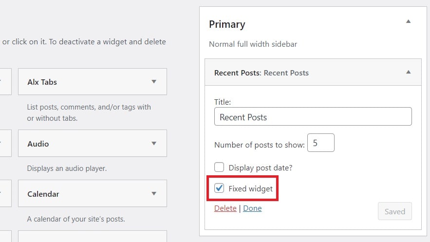
- And click on that Widget and click on Fixed widget box. And click on save.

This plugin lets you adjust how sticky widgets work on your site. Here’s how it’s easy to use:
- Go to Appearance > Fixed Widget Options on your website.
- You can control how far away from the top and bottom of the screen the widget sticks (think of it like setting space around it).
- Want to only show the sticky widgets to people who are logged in? No problem! You can turn them off for everyone else.
- Don’t like the widgets on small screens? Set a minimum size for them to appear, so they only show up on computers and tablets, not phones.
Basically, you can fine-tune how these sticky widgets look and behave on your site. It’s all in one place and super simple!
Note: Remember to double-check your mobile view after applying the “Fixed Widget and Sticky Elements” plugin, as sticky sidebars can sometimes disrupt the layout on smaller screens. Ensure everything looks neat and functions smoothly by testing different phone sizes and adjusting settings if needed.

Comments
web site